The fun part of travel.
Meet the new Thrillark. A new mark, new colours and a new voice, built around the bit of every trip people actually talk about afterwards.
Watch the film.
01The idea
02Why now
We outgrew the map.
Thrillark started in one city. Today people use it to find things to do in cities around the world. A brand built to point at a place couldn’t carry that, so we changed what it points at.
03The mark
From a pin to a hand.
Five shapes, one feeling.
- 1The armThrown up mid-celebration. It nudges when the hand winks.
- 2The folded fingersTwo short strokes. One of them folds down to wink at you.
- 3The tall fingerThe rock-on salute. The highest point of the mark, and of the day.
- 4The grinThe palm doubles as a smile. Turn the hand over and it’s a face.
04Motion
It winks back.
One finger folds, the arm nudges, the grin gets wider. Under a second, and the logo feels like it’s in on the fun with you.
05The logo
Big or tiny, still us.
Simple, chunky shapes that hold up at 16 pixels in a browser tab and at six metres on a billboard.
Lowercase on purpose
It reads like a friend’s name in a message, not a company on a sign.
Set in Geist SemiBold
The same typeface as everything else we make, so the logo and the headlines sound alike.
The hand leads
On an app icon, an avatar or a sticker, the mark works on its own.
06Colour
Forest, for calm. Lime, for the spark.
A deep green that lets photos breathe, and one bright Lime that only turns up for the good bits.
Backgrounds, text and the logo. Calm enough to sit behind any photo.
The hand, the payoff line, the button. Used like a highlighter, never as wallpaper.
Roughly how much of each
07Typography
One typeface, said with confidence.
08How we sound
09Photography
Mid-moment, not mid-pose.
10The look
One system, every size.
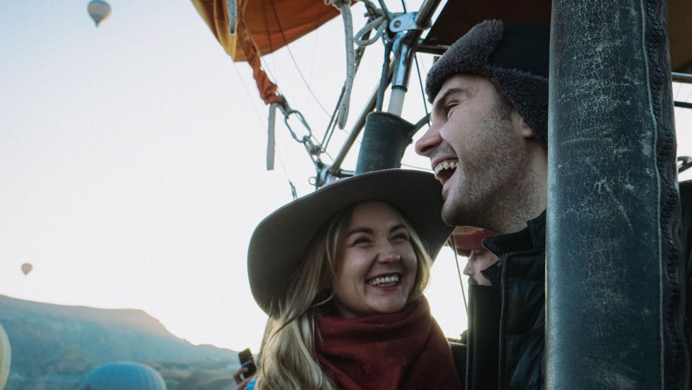
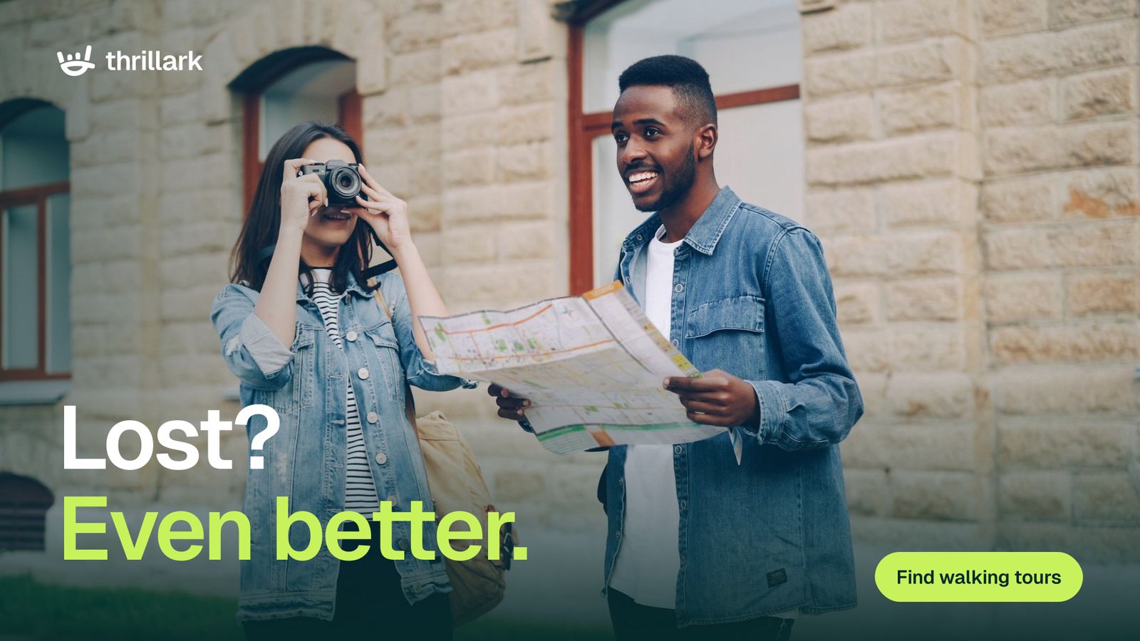
A real moment, a Forest fade where the words go, a setup and a payoff, one button. It works on a phone story and on a billboard.
Laughing by 6.
Book a balloon ride
new city.
Find things to do



11Everywhere
On your home screen, in your tabs.
That’s the new Thrillark
Same Thrillark. More fun.
Tours, attractions, adventures and nights out in cities around the world. Book in a few taps, then just show up.